JavaScriptやjQueryを使わないでCSSのみでテロップ表示のアニメーションを作成する方法を解説します。
Example
テストテロップテストテロップ
Code
HTML
<div class="telop">
  <p>テストテロップテストテロップ</p>
</div>
CSS
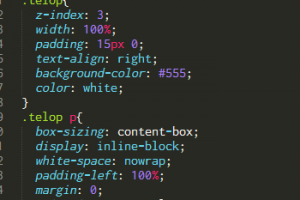
.telop{
  z-index: 3;
  width: 100%;
  padding: 15px 0;
  text-align: right;
  background-color: #555;
  color: white;
}
.telop p{
  box-sizing: content-box;
  display: inline-block;
  white-space: nowrap;
  padding-left: 100%;
  margin: 0;
  animation-name: telop;
  animation-duration: 15s;
  animation-timing-function: linear;
  animation-iteration-count: infinite;
}
@keyframes telop{
  from    { transform: translate(0%); }
  100%,to { transform: translate(-100%); }
}